Explorative Data Visualization for Disability Inclusion in Employment


Background
Globally, persons with disabilities face significant employment challenges, including lower participation rates, wage disparities, and accessibility barriers. This project aims to visualize employment data for persons with disabilities, helping policymakers, and advocacy groups better understand where inequalities exist and how to address them.
Problem Statement
Employment data on persons with disabilities is often complex and scattered across different sources, making it difficult for decision-makers to extract meaningful insights.
How might we design a clear, interactive, and accessible visualization to communicate these disparities effectively?
Data Collection
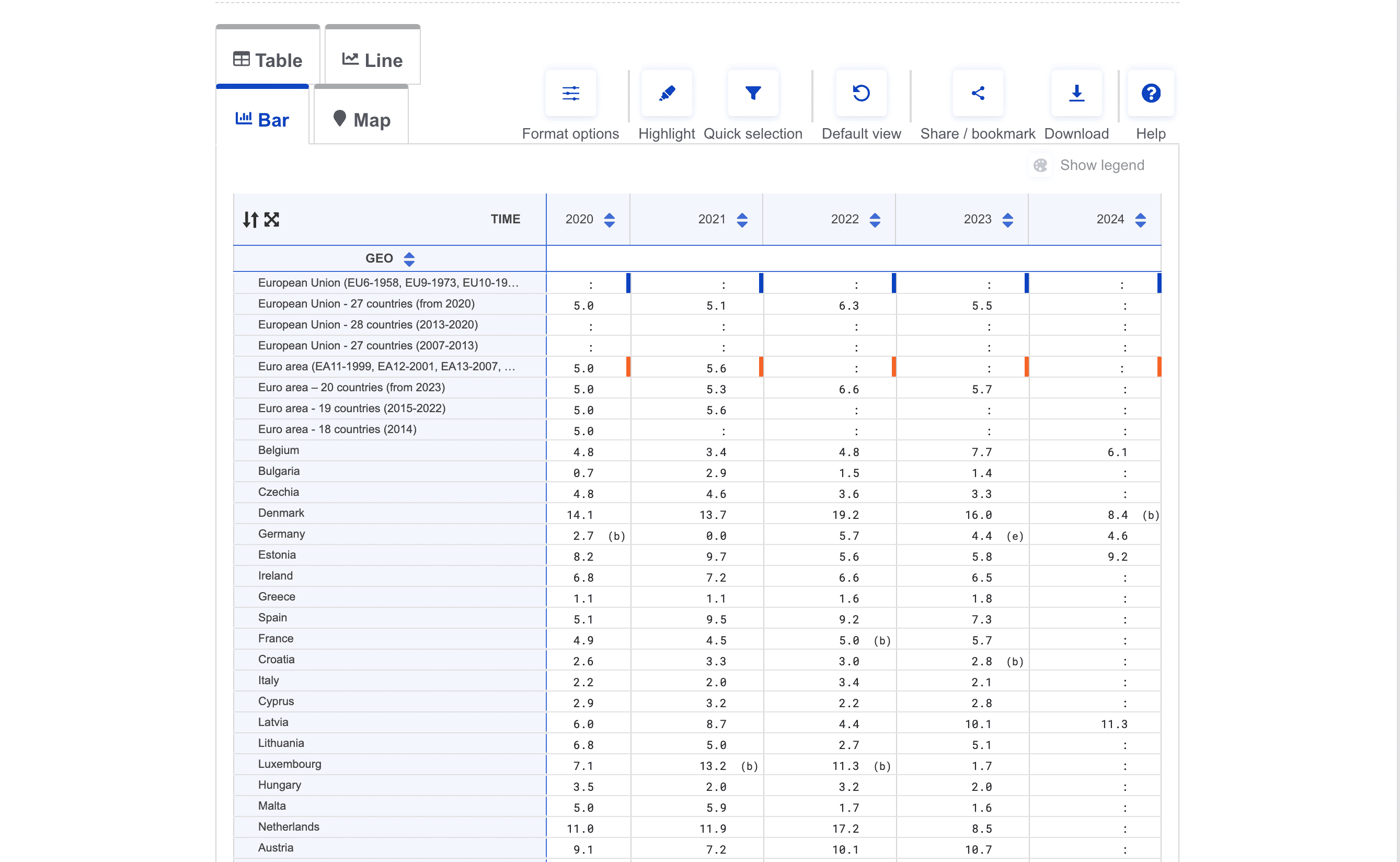
Sourced employment data from ILO, the World Bank, and eurostat(official website of the European Union), ensuring credibility. However, gaps in the data, missing values, and inconsistent time series records required extensive data cleaning and aggregation before visualization.
Design
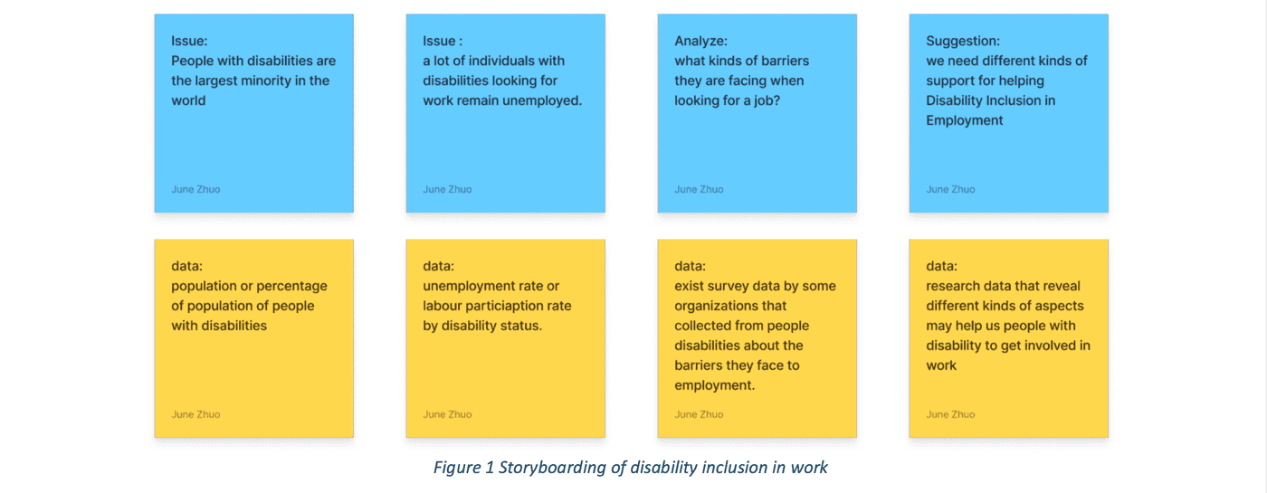
Storytelling for Visualization
Instead of overwhelming users with data, I structured the visualization as a progressive narrative:
- The Reality: A donut chart visualizing the sheer size of the disabled workforce.
- The Challenges: Bar charts breaking down employment barriers.
- The Trends: Line graphs showing progress (or lack thereof) over time.
- The Future: A section encouraging users to reflect and take action.

Result
I built a single-page web visualization using D3.js for dynamic charts and React.js for the interface. The final product presents employment trends and barriers, helping audiences gain quick insights into disability inclusion in the workforce.
Users can filter by country, making the experience dynamic and personalized. Timeline of line chart allows them to see how employment rates have changed over time, exposing long-term trends
🔗 Live Demo: Visual Disability Employment
Outcome
📌 Turn Data into Visual Insights
This project transformed existing disability employment data into an accessible visualization, helping policymakers and organizations quickly identify employment disparities. By structuring key metrics with donut charts, bar graphs, and line charts, the visualization effectively highlighted workforce participation rates, gaps, and long-term trends.
📑 Learn from Challenge
One unexpected challenge was finding reliable data. Employment statistics for disabled individuals are often incomplete or inconsistent. This taught me the importance of transparency in data visualization—acknowledging gaps rather than trying to cover them up.
Takeaways
💬 Storytelling in Data Visualization
A key learning from this project was the importance of storytelling in organizing data to make insights more intuitive. Instead of presenting raw statistics, structuring data in a clear narrative flow helped guide users toward meaningful takeaways. Balancing data depth and simplicity was also crucial—while interactivity could enhance exploration, a clean, focused visualization proved more effective for quick insights.
✨ Clarity Over Complexity in Data Design
Balancing data depth and simplicity was crucial—while interactivity could enhance exploration, a clean, focused visualization proved more effective for quick insights. Working with incomplete datasets also reinforced the need for transparent, responsible data storytelling, with future improvements focusing on filtering options, real-time updates, and accessibility enhancements.